
Click the above image to enlarge.

Click the above image to enlarge.

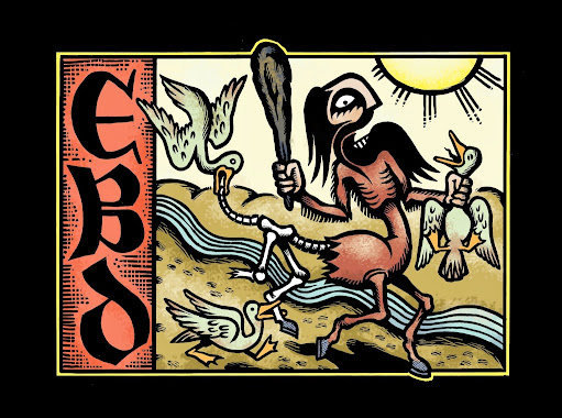
Cover detail.

Back cover detail.

Inside detail.
Brian Morissey, a band member and my primary contact on the job, wanted a cover that incorporated various thematic elements from the songs on the album. Naturally, my first request was for a copy of the songs. Even without a specific call to incorporate the themes of the songs into the art, it's absolutely necessary to hear a band's music and get a feel for them. By proxy, you can make inferences about the type of people listening to the album and what sort of art might ring true with them. I think my background as a print designer makes me see all jobs as branding jobs on some level which isn't necessarily a bad thing.
Staying true to the band and their audience while giving things my own unique spin makes album art a pretty collaborative process. Managers, band members, and, depending on the label or the agency handling things for the label, art directors all bring something to the table.
The music industry is a bit of a different animal than most my work. Pay rates seem to be down across the board and a lot of the managers, specifically, just want merch and they want it yesterday. I sometimes get a sideways look when I ask to hear the band's music and voice my intention to send over multiple roughs and concepts. IE, "Just draw something, eh!"
If I get that sort of vibe, I respond accordingly and do the best I can with the materials and time provided. Ideally, I'd pass on all such jobs, but, hey, we all have bills to pay and a few sneak in. Luckily, this job had more in common with the vast majority of commercial illustration that I do. I did some initial thumbnails which I didn't think to upload, but otherwise have a shot of each step below.


Getting the colors done right was a little tougher. You see, I have a bit of a case of the neons. I love bold, saturated, secondary colors that really have no conventional right to sit next to each other. They're not right for every instance by any means, but my natural inclination is to pursue them and at least try them on for size.
With some back and forth with the band, I settled on something with a more limited palette. Using fewer colors and highlighting only the important bits of the characters and props strengthened things quite a bit. In the end, I'm really happy with how it turned out. I can't wait to see it printed!


5 comments:
really impressive stuff Ray. I really love the colors. I would have absolutely loved this art as a kid which is how I judge a lot of art these days. Beautiful and great to see process art as well.
mostyn
I find that I'm gravitating towards the stuff that excited me as a kid more and more.
I really like the brushwork and the colors, but some of the anatomy seems kind of off to me. The left arm of the pickpocketer, for instance.
Excellent Piece, Ray. And intriguing color choices as usual. I've heard and had nothing but trouble related to doing artwork for bands. I spent a fair amount of time a few years back reworking some of my digital stuff for one band to purchase for record covers and tshirt designs only to find out they didn't want to pay for it after a fee had been decided. Then after not hearing back from them for awhile I looked up their band name, can't even remember it now, only to find out they'd used low res copies of my digital art I'd emailed them for their cover.
Aeron, the music industry seems to be my worst client, to make sweeping generalizations. I do very little of it. Thankless, low pay work, for sure.
Luke, I agree. I didn't use any reference and it shows. I need to get on that.
Post a Comment